
This palette started in the most inauspicious way: I had bought a bundle of 6 skeins of yarn, different fibers all dyed at the same time, in burgundy and gold. It wasn’t until I had triumphantly spread them out at home that I realized… they really weren’t that attractive. In fact, they reminded me more than anything of college team colors. I prefer a blended, Impressionist-style look to the colors in my knitwear designs, so this ultra-contrasty color combination was, frankly, turning me off. (For some reason, it never occurred to me to simply return the yarns!) What could I do?
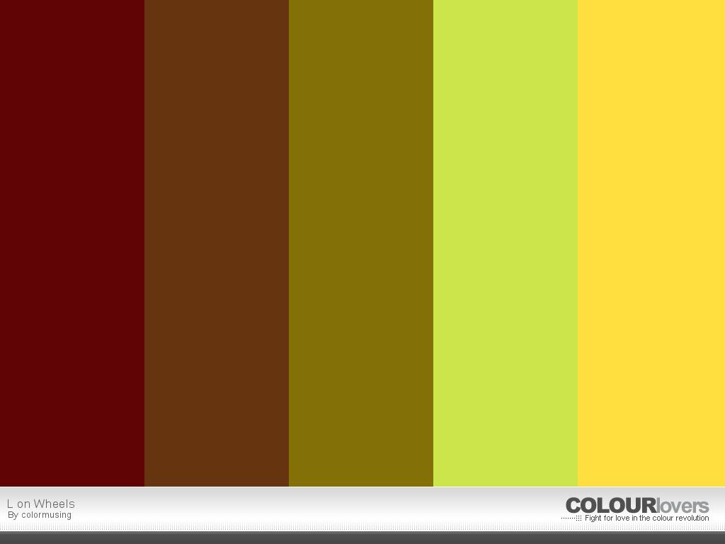
I decided the best make-a-silk-purse strategy was to develop a color palette, starting and ending with the burgundy and gold, with colors in between that would hopefully create a smooth transition. After a lot of experimenting, I actually came up with 3 different options, all varying rather wildly from each other; L on Wheels* is the one I decided to use for this particular sweater project.


")

So even though I started with colors I didn’t even particularly like, I (to quote Tim Gunn) made it work! And I’ve now applied this palette to 2 things I’ve never done before: ceramic painting (my yarn bowl, above) and jewelry design. (I also used this palette in the colormusing logo!) Next up: a mini travel wardrobe. Hey, I already have the sweater that will coordinate with it!
* See this palette and lots more here: http://www.colourlovers.com/lover/colormusing
