It’s official: Pantone*, the standard-bearer for all things color-related, has announced its 2017 Color of the Year!
Meet Greenery!

It’s official: Pantone*, the standard-bearer for all things color-related, has announced its 2017 Color of the Year!
Meet Greenery!
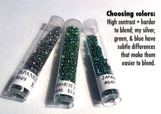
Colormusing’s Palette of the Month for August is Seaspray, inspired by this beaded bracelet that blends iridescent silver, emerald green, and ultramarine blue into this amazing ombré bracelet:
As much as I love my colorful stripe-y palettes (and I do), even I am occasionally in the mood for something a little fancier. Here’s one of my favorite ways to change those stripes:
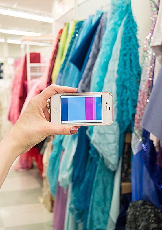
Just published in Colette Patterns‘ sewing magazine Seamwork: My latest article on using color palettes in real life! It’s called Color in Your Closet: Discover (and Use) the Palette Within.
Features:
Want to see sewing stuff from Colormusing? Check out myBratelier (lingerie sewing, including bras!), and Changing Your Clothes, which covers everything from repairs & alterations to dyeing and remaking thrift-shop finds. And don’t miss all my newest projects, including sew-alongs, at the brand-new SewColormusing blog!
Click on the dots above to visit my mother ship, Colormusing.com, where you can also sign up to receive Hue News, Colormusing’s own monthly e-mail newsletter!
In my last post, I introduced you to the idea of easily expanding the color range of a basic color palette by using the Mosaic filter in Photoshop. Now, starting with that expanded palette, we’ll take it to another level to create The Confetti Wave Palette! And when we’re done, I’ll show you some of my favorite ways to use this super-fun new version.
Let’s start with a new palette, with a sneak preview:
Here’s something I recently discovered by accident (isn’t that always the way?): Starting with one of my color palettes, which typically have a maximum of 5 colors, I can expand that palette into 8-1o colors— and it’s super-easy to do!
Let’s start with a palette that’s divided evenly into 5 colors:
Filed under Good News & Bad News: The good news is that Shutterstock, one of the largest stock photography companies, has accepted my work to sell on their site! Yes, I’m already selling some of my images on my own site (in the Digital Graphic Files collection), so why sell on Shutterstock too? Well, primarily because they do the work of formatting my images in a range of sizes, making it easy to find just what you need, and also because they reach a huge world-wide marketplace. Good news, indeed.
Valentines. Hearts, flowers, pink, red, shiny, chocolate-y, sparkly, sweet— today, they’re all around us, in fact, we can’t get away from them. But here’s the thing: I really wanted to show you a quick Valentine-esque project, one that would show you an easy way to apply a color palette to the most basic typographic design— but I didn’t want to throw even more saccharine-sweetness at you. So I designed this graphic, bold thing to be merely the vehicle for adding a bunch of useful skills to your own design toolkit:
As I mentioned in my recent post following Pantone’s announcement of their co-Colors of the Year (COTY), Pink Quartz and Serenity, my initial reaction was, well, raised eyebrows (she understated.) And now, several days later, do I feel any differently? Hmm. No, not really. I’m skeptical. As much as I want to embrace every hue in the color world equally, I feel like I’ll have to work really hard to think of ways to use what looks to me like colors that belong in a nursery. But I’m trying to keep an open mind— let’s see how we can make these colors work!