

Filed under Good News & Bad News: The good news is that Shutterstock, one of the largest stock photography companies, has accepted my work to sell on their site! Yes, I’m already selling some of my images on my own site (in the Digital Graphic Files collection), so why sell on Shutterstock too? Well, primarily because they do the work of formatting my images in a range of sizes, making it easy to find just what you need, and also because they reach a huge world-wide marketplace. Good news, indeed.

The bad news? Shutterstock sells stock images— by definition, fairly generic stuff (meaning images that have maximum versatility), and they also only accept the highest image quality. As they should. What that means for me is that a lot of my photos simply don’t fit into their definition of stock content, and even some of what I consider my best work doesn’t meet their quality standards. It’s gotten a little depressing seeing all those “Not approved” e-mails, after all the work of formatting, uploading, and writing descriptions and tags.
But wait— there’s more good news! I decided to take all my rejected photos and do something else with them (as I am wont to do). This time, I thought I’d turn them into mosaics to be used as backgrounds. So I’ll show you how to do that, and (bonus!) I’ll give you some ideas for how to use your cool mosaic backgrounds!
Note: As usual, I’m working in Adobe Photoshop CC, but this procedure is simple to do in almost any paint program, including Photoshop Elements.
First, pick a photo, any photo. Well, almost any*. Start with an image that has a fairly consistent tonal range, like this:

Next, just to be on the safe side, I like to duplicate the layer with my photo on it; I make changes to the topmost copy only, so I can go back to the original photo later if I want to.

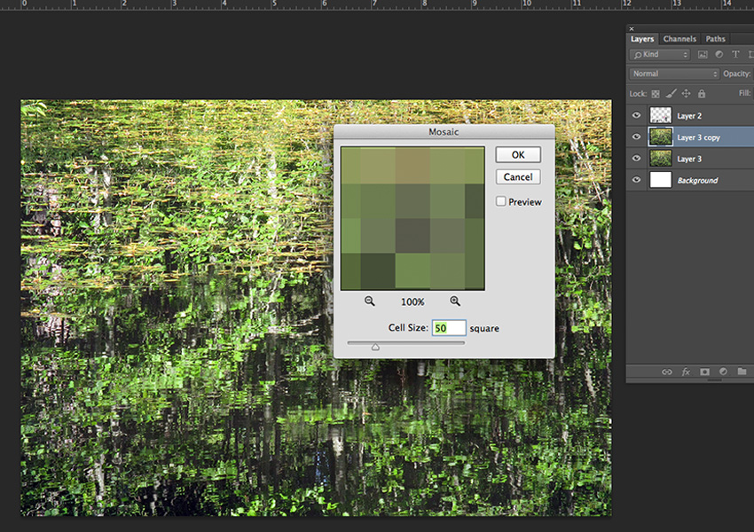
Finally, with the top photo layer selected, go to Filter—Pixelate—Mosaic. A dialog box will pop up, asking you how big you want your squares to be.
Tip: Consider your image size when choosing your mosaic square size; the image size should be a multiple of the square size. This will ensure that the squares will come out evenly at the edges, rather than being cut off into partial squares. In my examples, my image size is 850 x 600 (pixels), so I chose a square size of 50 (which multiplies evenly into both 850 and 600).
Once you’ve chosen your cell (square) size, click OK.

Yes, it is that easy!
But what do you do with it? (You know you were wondering.)
Off the top of my head:
- Use it as a background for a blog or website header;
- put your name (or logo, personal quote, etc.) on top of the mosaic for a unique social media profile or cover image;
- use the mosaic as a background for a photo montage;
- have it custom-printed onto fabric;
- background for a book cover design;
- cut out a portion of the center of the mosaic, and use the rest as a frame;
- background for presentation or video title screens.
I’m sure you’ll think of more! Here are some quick examples:


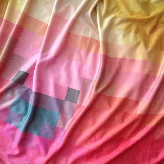
This fabric started with the same idea (turning a photo into a mosaic), but with a different photo:
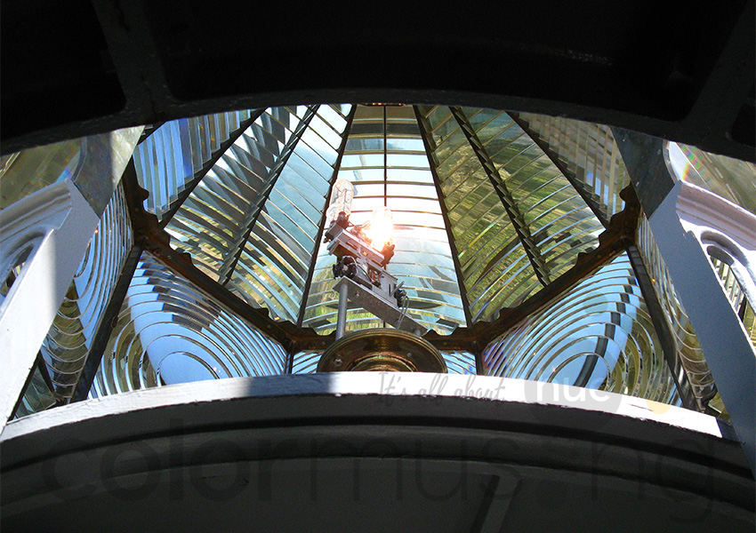
*Tip: While trying out the mosaic idea with my whole folder of photo rejects, I did discover that certain types of photos are better suited for the mosaic treatment; images with less contrast overall seem to do better. Here’s a high-contrast image:
And here it is, made into a mosaic:
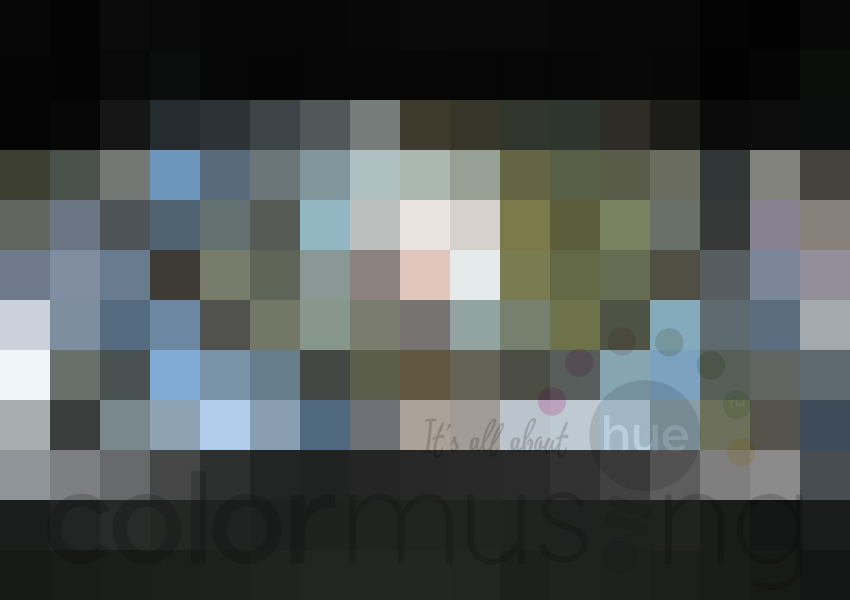
Truthfully, I’m finding that blurry images actually make some of the best mosaics— it’s really the colors in the image that matter more than the technical quality. And I was also noticing that, as soon as I hit that OK button to turn the photo into a mosaic, I’m suddenly seeing colors that I hadn’t specifically discerned before— I feel a whole new series of palettes coming on!
Well, I hope this inspires you to make beautiful mosaic designs with your own previously under-appreciated photos. And as always, I’d love to see what you make with this idea!

Want to see sewing stuff from Colormusing? Check out myBratelier (lingerie sewing, including bras!), and Changing Your Clothes, which covers everything from repairs & alterations to dyeing and remaking thrift-shop finds. And don’t miss all my newest projects, including sew-alongs, at the brand-new SewColormusing blog!
Click on the dots above to visit my mother ship, Colormusing.com.

1 Comment