
For the final post in this unintentional series, I’ll show you one of my favorite tricks to quickly create a … More

The practical pleasures of living in color
For the final post in this unintentional series, I’ll show you one of my favorite tricks to quickly create a … More
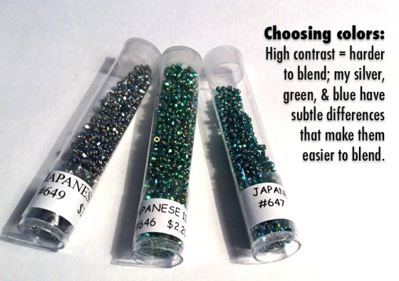
Colormusing’s Palette of the Month for August is Seaspray, inspired by this beaded bracelet that blends iridescent silver, emerald green, … More

As much as I love my colorful stripe-y palettes (and I do), even I am occasionally in the mood for … More

In my last post, I introduced you to the idea of easily expanding the color range of a basic color … More

Here’s something I recently discovered by accident (isn’t that always the way?): Starting with one of my color palettes, which … More

Filed under Good News & Bad News: The good news is that Shutterstock, one of the largest stock photography companies, … More

Valentines. Hearts, flowers, pink, red, shiny, chocolate-y, sparkly, sweet— today, they’re all around us, in fact, we can’t get away … More

As I mentioned in my recent post following Pantone’s announcement of their co-Colors of the Year (COTY), Pink Quartz and … More

Since we’ve been working hard in November to add more downloadable photos and their related color palettes to Colormusing’s new … More

Okay. I bet some (or a lot) of you are looking at my color palettes and wondering, “What am I … More
