
Okay. I bet some (or a lot) of you are looking at my color palettes and wondering, “What am I supposed to do with these, anyway?” I understand. There’s something of a disconnect between looking at something pretty, and knowing how to apply it in a practical way.
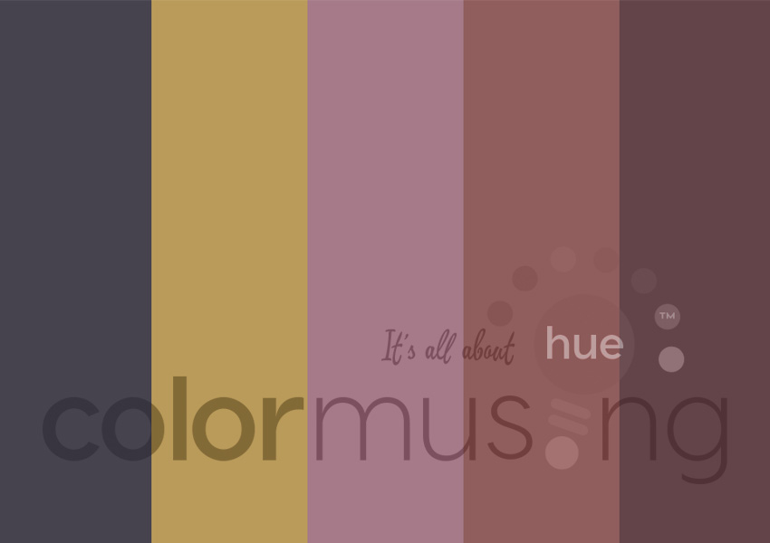
So this tutorial will be the first of several (or a lot) that will not just make suggestions, but actually show you how to put palettes to work for you. I’m going to start off with November’s Palette of the Month (POM): Paris Reflection.

This is a great palette to start with, because it has a nice range of colors and color types: neutral (charcoal grey), tonal (the 3 colors on the right), and a brighter accent hue (gold). Right off the bat, I think I can use the charcoal for text, one of the tonal colors for links, and the gold for embellishments like page dividers. But let’s see how this would work on an actual blog page.
Note: Because my blogs are on WordPress, that’s what I’ll be using as my example in this tutorial. If you’re not using WordPress, these instructions might have to be modified, depending on your blog platform’s options.
Here’s how this palette looks when the PSD file is opened in Photoshop (PS):
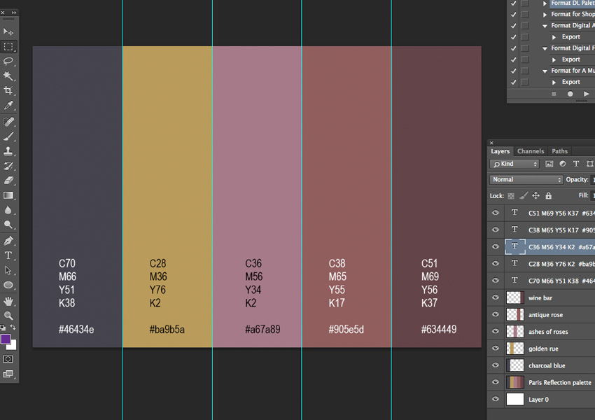
Now we’ll put some of that color information to good use!
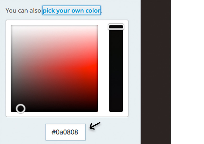
Tip: For a blog (or other screen-based use), you’ll probably only need the hex codes; these are the 6-digit numbers starting with #. The CMYK values included in each palette’s PSD file are generally used in things that will be printed (I’m planning tutorials for these also).
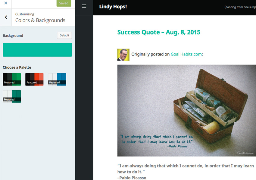
Well, I just pulled up one of my other blogs, which is clearly suffering from some neglect— making it a great candidate for a makeover! Here’s what it looks like now:

When I click on the Customize button, then Colors & Backgrounds, this is what comes up:
Clicking on any of the Featured palettes changes the background color; when I clicked on the red/black palette, the background changed from green to black. But I want to use one of my own palette colors (she whined). So I changed back to the original green color bar, clicked the Change button, and got this:
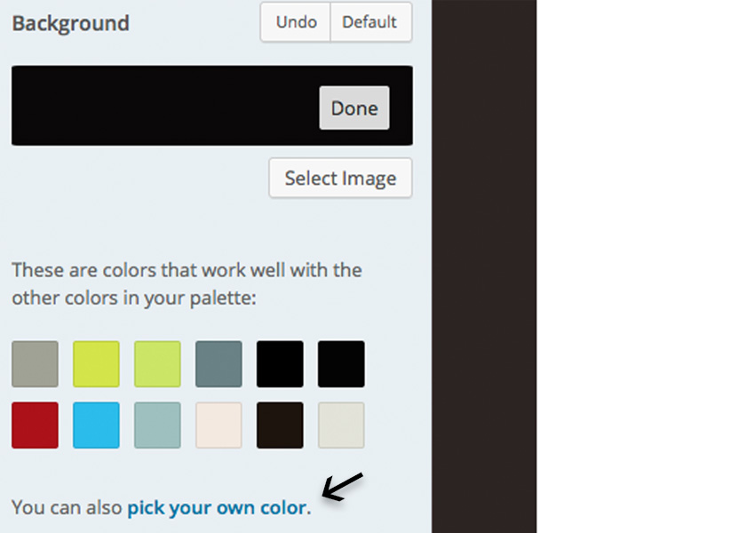
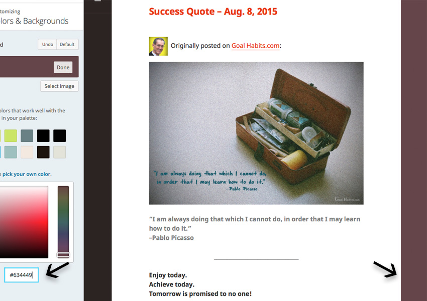
Hmm. Now that I’ve changed the background, suddenly the bold header text has changed to red. (If you scroll back up and look at the original blog page, this text is the same color as the background.) And red does not look so great with my new background color. And after a little investigating, it looks as though I can’t change that text color without going the Custom Design route (this requires an upgrade). It’s possible that this is a limitation of the theme I’m using; I’ll experiment with different themes and get back to you on this.
Hey, this stuff happens to all of us, right? We think we’ve got it figured out, and… roadblock! But I’m sure there’s a solution, and when I find it, I’ll post an update.
Meanwhile, play around with new hex codes on your own blog. On WordPress, you’re not committed to the changes until you hit the Save & Publish button, so try some new colors and see what happens!
