
For the final post in this unintentional series, I’ll show you one of my favorite tricks to quickly create a … More

The practical pleasures of living in color
For the final post in this unintentional series, I’ll show you one of my favorite tricks to quickly create a … More

Seriously, why didn’t I anticipate these palindromic dates? I mean, it’s December of 2021! 12… 21… and there’s even one … More
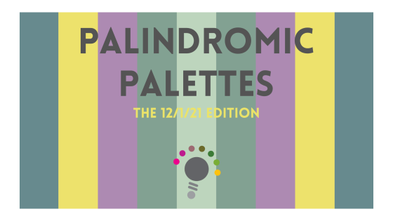
This morning, I was jotting down some notes, and added today’s date as I usually do: 12/1/21. Notice anything? It … More

It’s official: Pantone*, the standard-bearer for all things color-related, has announced its 2017 Color of the Year! Meet Greenery!
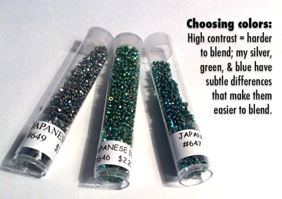
Colormusing’s Palette of the Month for August is Seaspray, inspired by this beaded bracelet that blends iridescent silver, emerald green, … More

In my last post, I introduced you to the idea of easily expanding the color range of a basic color … More

Filed under Good News & Bad News: The good news is that Shutterstock, one of the largest stock photography companies, … More

As I mentioned in my recent post following Pantone’s announcement of their co-Colors of the Year (COTY), Pink Quartz and … More

Okay. I bet some (or a lot) of you are looking at my color palettes and wondering, “What am I … More

Hot off the press! (You know what I mean.) On November 1, 2015, Colormusing will send out its very first … More
