
For the final post in this unintentional series, I’ll show you one of my favorite tricks to quickly create a beautiful background, using (surprise!) a Palindromic Palette.
Quick refresher: To mark the highly unusual palindromic dates in December 2021, my first Palindromic Palettes post from 12/1/21 started with my basic process for creating a palindromic palette:
- Open a palette file. (The ones I used in the examples below are all formatted as squares, but they don’t have to be.)
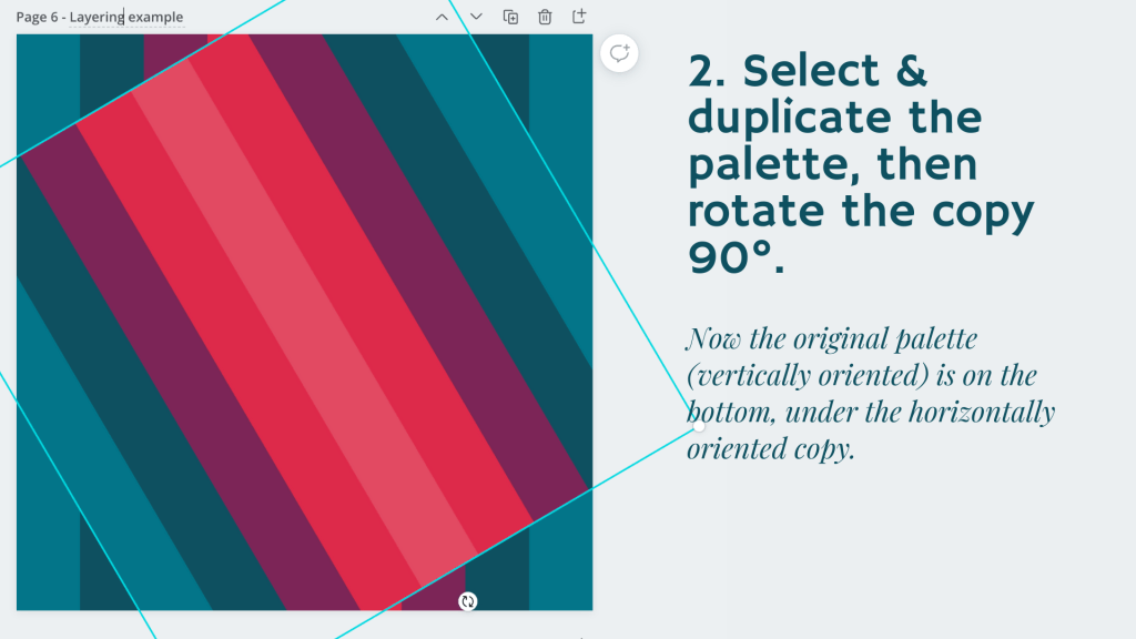
- Make a copy of the palette (in the same document).
- Flip the copy horizontally.
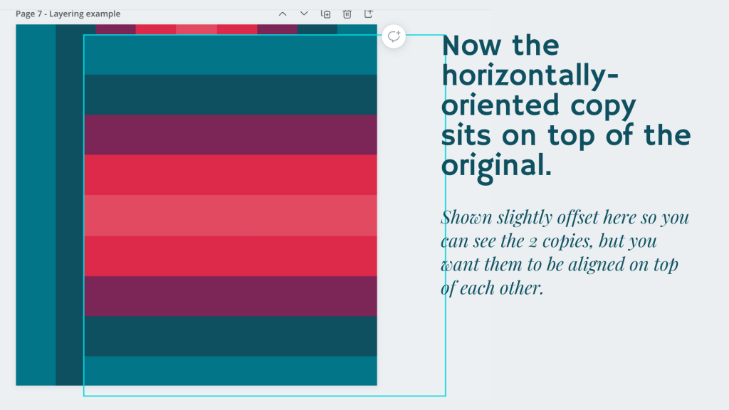
- Align the 2 palettes to combine into your very own Palindromic Palette!
In Part Deux, the 12/11/21 post, I showed you how simply turning a palindromic palette 90° could give a completely different look, as well as additional design options. And today, for my final Palindromic Palettes post to mark 12/22/21, we’ll take that idea one step further, thus:
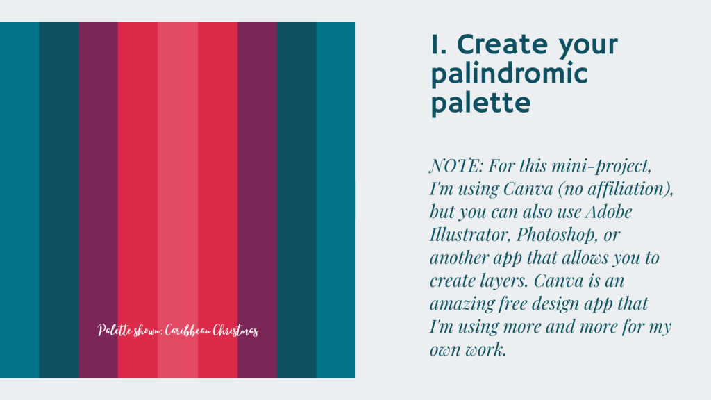
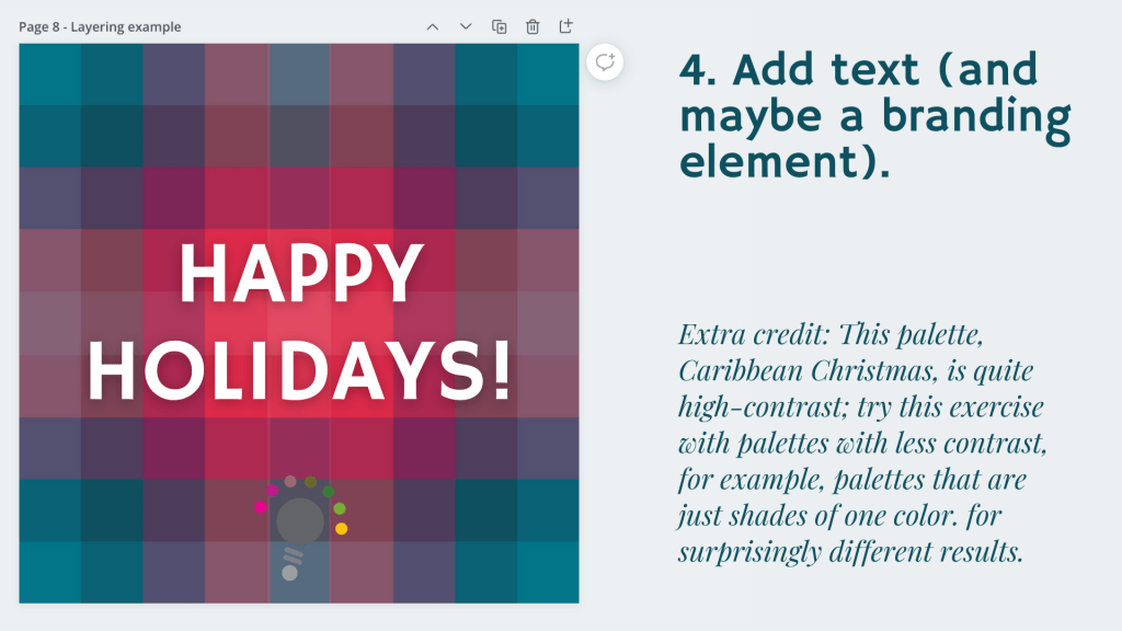
And as mentioned on that last screenshot, I highly recommend trying this super-quick project with a wide variety of palettes to see what a difference it makes to use different color combinations. My Caribbean Christmas palette, used in this example, is particularly high-contrast with its color range from deep teal to bright coral-red, so going in the opposite direction, like with a palette that’s all pastel-y shades of pinks or taupes would look incredibly different from my example. Pro tip: If you already have your own branding color palette, why not use that for branding graphics, social media designs, etc.??
Happy Holidays, all!
Lindy
P.S. I would be thrilled to see what you come up with from this mini-tutorial! Post your designs below!
P.P.S. I’m busy setting up my very own YouTube channel, and a video version of this post will be available very soon — I’ll add a link here when it’s ready!
