
Seriously, why didn’t I anticipate these palindromic dates? I mean, it’s December of 2021! 12… 21… and there’s even one more after this!
As I mentioned in my first Palindromic Palettes post from 12/1/21 (see the same-backwards-as-forwards palindrome?), here’s my basic process for creating a palindromic palette:
- Open a palette file. (The ones I used in the examples below are all formatted as squares, but they don’t have to be.)
- Make a copy of the palette (in the same document).
- Flip the copy horizontally.
- Align the 2 palettes to combine into your very own Palindromic Palette!
And here are some new examples, this time using Colormusing palettes with a Christmas theme. (Christmas nostalgia alert: Wet Christmas is my ode to holidays in the Pacific Northwest in the U.S., where I grew up.)


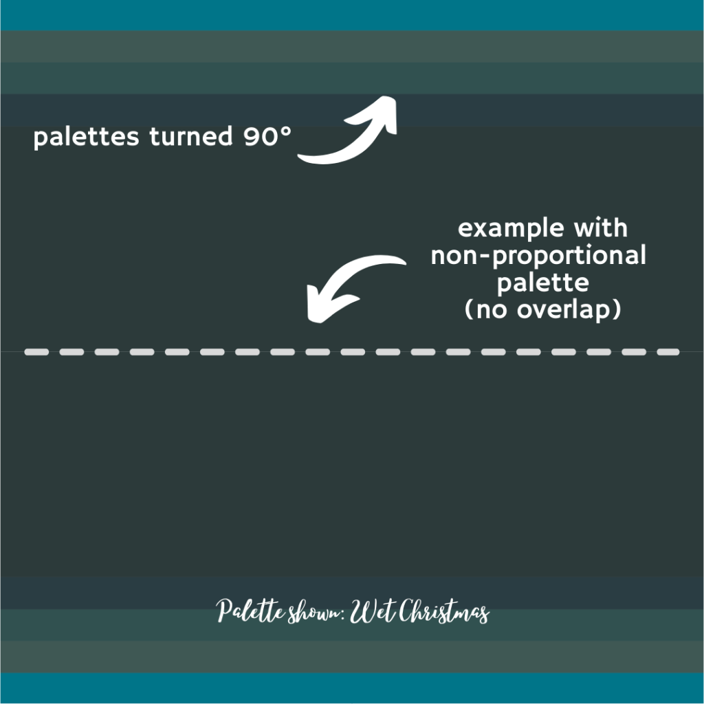
Last time, I promised to give you some examples of flipping palettes around so the stripes are running horizontally rather than vertically; you can see this in the Blue Christmas and Wet Christmas examples here. They feel completely different, right? I also formatted the examples in this post as square images, rather than the 1920 x 1080 format from the first palindrome post (fantastic for videos or presentations), which will hopefully inspire some creative new social media post design ideas — these palindromic palettes would make wonderful backgrounds for quotes, as in this (non-palindromic) example from my own Instagram post:

Well, I may have been behind the curve for 12/1/21 and 12/11/21, but at least I will be on top of the final palindromic date of the year, which will be 12/22/21 — look for another post about this, with completely new ways to combine and use your own palindromic palettes, and I’d love to see your suggestions for examples I could try!
XOXO,
Lindy
P.S. I’m busy setting up my very own YouTube channel, and a video version of this post will be available very soon — I’ll add a link here when it’s ready!

1 Comment