

This morning, I was jotting down some notes, and added today’s date as I usually do: 12/1/21. Notice anything? It took me a minute to confirm it, but this date does indeed read the same backwards as forwards — a palindrome! I don’t know about you, but it’s pretty rare that I run across a palindromic example just by chance (and let’s face it, this particular date will not happen again). And hard on the heels of this revelation, this thought popped into my head: What if I illustrated the concept of a palindrome with my palettes??
Here’s my basic process:
- Open a palette file. (The ones I used in the examples below are all formatted as squares, but they don’t have to be.)
- Make a copy of the palette (in the same document).
- Flip the copy horizontally.
- Align the 2 palettes to combine into your very own Palindromic Palette!
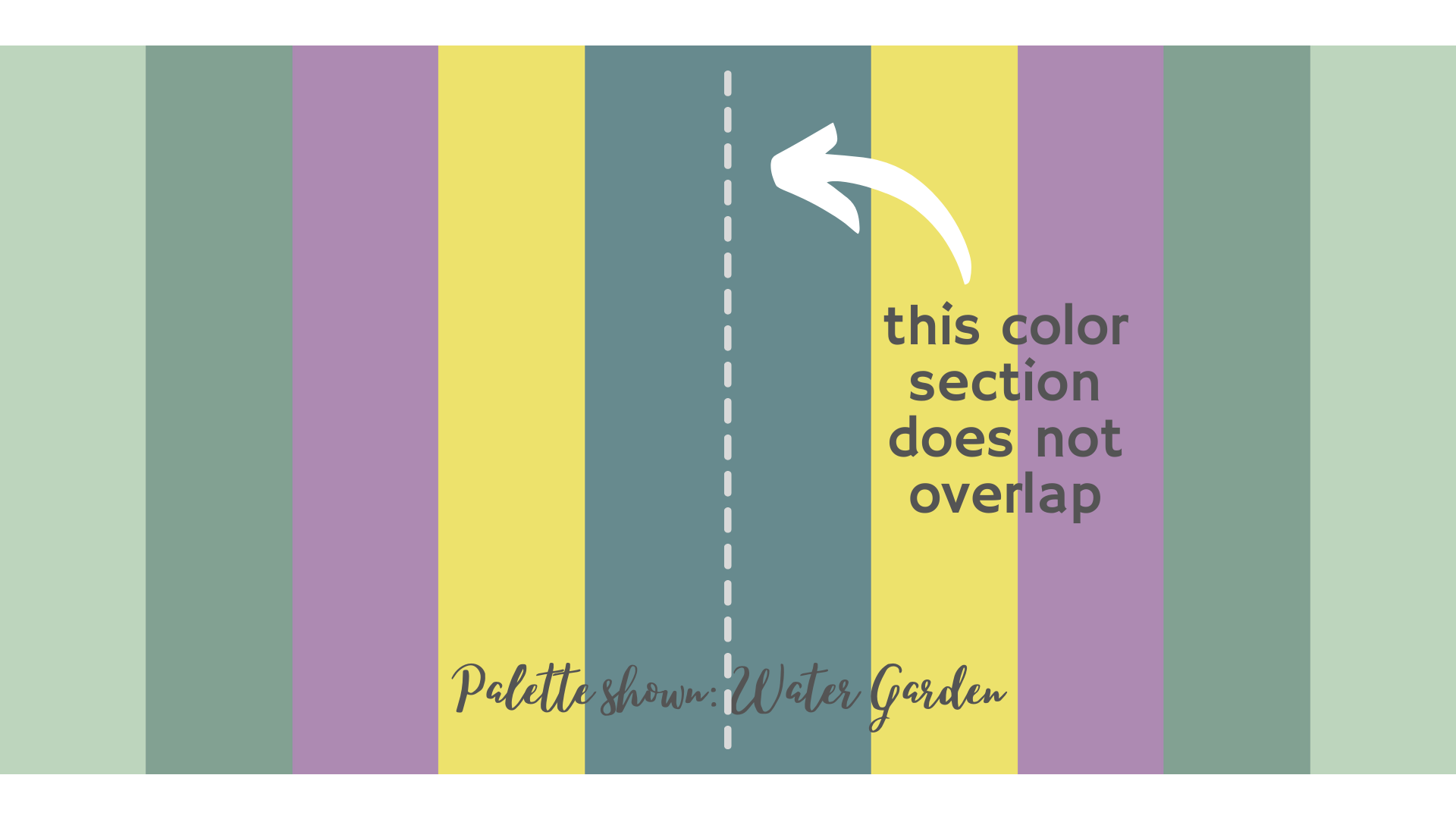
And here are some examples using Colormusing palettes:


I wanted to post this before this auspicious day ends, so I’ll leave you with this thought (and a promise to do some follow-ups on this idea later, including ways to use your Palindromic Palettes): Experiment with flipping the palettes in different directions! For example, you could take the Tuscan Summer palette above and flip both copies in the opposite direction, so that the center block would be the dark blue-violet color, rather than the deep aqua.
And for that matter, imagine that Tuscan Summer Palindromic Palette rotated 90 degrees, so the dark blue-violet blocks are at the top and bottom — that kind of vertical formatting would work fantastically well as a background for Instagram Stories and other vertically-oriented graphics like social media ads.
See what I mean about experimenting? Once you get started on this, I bet you’ll have so much fun, you won’t want to stop — I know I don’t!
XOXO,
Lindy
P.S. I’m busy setting up my very own YouTube channel, and a video version of this post will be available very soon — I’ll add a link here when it’s ready!

2 Comments