
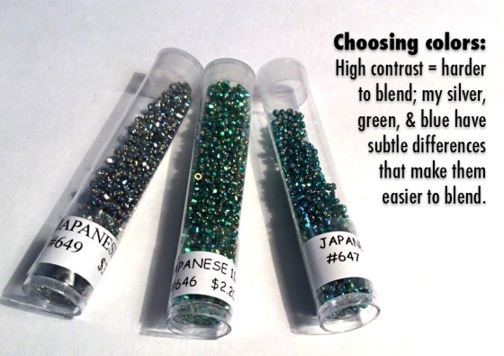
Colormusing’s Palette of the Month for August is Seaspray, inspired by this beaded bracelet that blends iridescent silver, emerald green, … More
The practical pleasures of living in color
Colormusing’s Palette of the Month for August is Seaspray, inspired by this beaded bracelet that blends iridescent silver, emerald green, … More

As much as I love my colorful stripe-y palettes (and I do), even I am occasionally in the mood for … More

Just published in Colette Patterns‘ sewing magazine Seamwork: My latest article on using color palettes in real life! It’s called … More

In my last post, I introduced you to the idea of easily expanding the color range of a basic color … More

Here’s something I recently discovered by accident (isn’t that always the way?): Starting with one of my color palettes, which … More

Have a lot of artwork to hang? It can be awkward, particularly if they’re all different sizes; arranging them to … More

After I finished the Silk Purses photo-montage tutorial the other day, I thought of some other ways to combine the same 2 … More
