
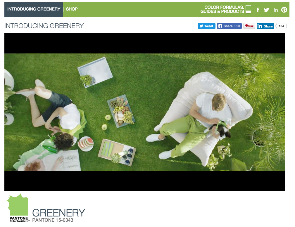
It’s official: Pantone*, the standard-bearer for all things color-related, has announced its 2017 Color of the Year!
Meet Greenery!
And scroll down the page to see Pantone’s ideas for using Greenery in color palettes— Moody Blooms is my favorite.
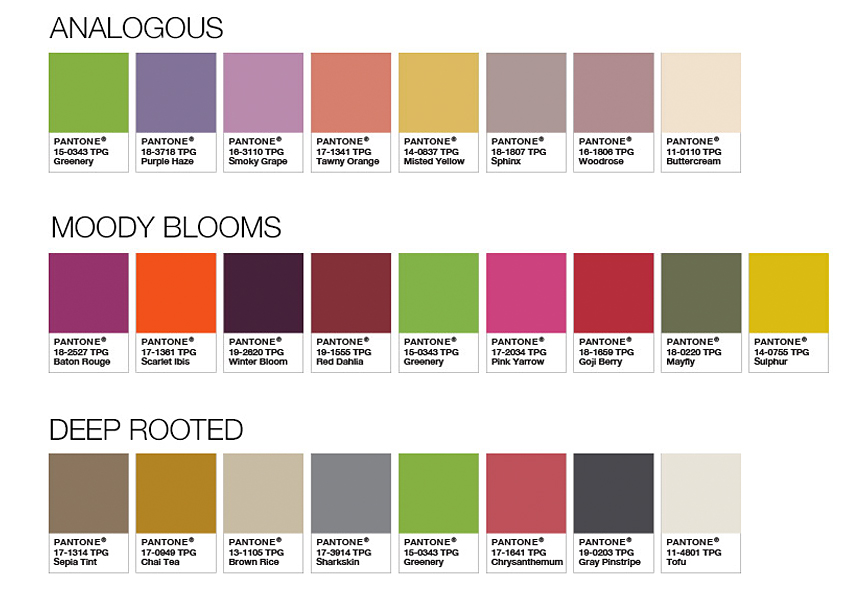
Bonus: You can download all these Pantone palettes for use in Adobe applications like Photoshop and Illustrator! (Look for the link under the palettes on this same Pantone page.)
What do you think of the Color of the Year? This bright, warm, leafy green makes me happy just to look at it! (It helps that I love virtually any shade of green, but this one is particularly cheerful.)
But as usual with color palettes, I immediately want to visualize ways to actually use this happy hue; it’s the type of color I tend to associate with accents and focal points rather than overall use. Off the top of my head:
- throw pillows on a neutral couch (picture 3 or 4 of the colors from the Moody Blooms palette above, playing nicely together on a deep burgundy leather sofa);
- newsboy-style cap (that 70s vibe, you know);
- napkins (including paper ones) and/or placemats (or am I the only one who still likes and uses placemats?);
- table lamp with a neutral (I’m thinking bronze) base and Greenery shade;
- Greenery-toned washcloths to brighten up your bathroom’s taupe towelscape;
- strappy sandals for spring (because doesn’t Greenery make you think of spring?).
Think about various textures too; this beautiful green looks quite different in, say, shiny dessert plates or semi-transparent drinking glasses than in soft, matte-textured cotton towels. Hmm, now I’m wondering what it would look like to have several throw pillows, all in the Greenery color, but each in a different texture: leather, satin, fuzzy mohair, thick & thin wool knit…
What ideas do you have for getting some Greenery into your life? Wardrobe, home decor, office (I can see file folders in this bright green), dishes, gift wrap? Spring wedding, perhaps? Whether your own holiday season is white, blue, or green, I’ll bet you’ll be inspired to use Greenery too!

Oh look, Greenery is already in my own logo colors!
Want to see sewing stuff from Colormusing? Check out myBratelier (lingerie sewing, including bras!), and Changing Your Clothes, which covers everything from repairs & alterations to dyeing and remaking thrift-shop finds. And don’t miss all my newest projects, including sew-alongs, at SewColormusing!
Click on the dots above to visit my mother ship, Colormusing.com, where you can also sign up to receive Hue News, Colormusing’s own monthly e-mail newsletter!
*I am not affiliated in any way with Pantone, or any other companies, as of this writing (I will let you know if that changes).
