

As I mentioned in my recent post following Pantone’s announcement of their co-Colors of the Year (COTY), Pink Quartz and Serenity, my initial reaction was, well, raised eyebrows (she understated.) And now, several days later, do I feel any differently? Hmm. No, not really. I’m skeptical. As much as I want to embrace every hue in the color world equally, I feel like I’ll have to work really hard to think of ways to use what looks to me like colors that belong in a nursery. But I’m trying to keep an open mind— let’s see how we can make these colors work!

Even on Pantone’s site, they’re consistently showing these 2 colors blended together, creating a kind of mauve-y lavender shade— pretty, but still very Easter egg-pastel, to my eye (not my favorite color range). However, I’d like to do my own blending to see what happens; here’s what I’ve done so far.
Step 1: Blend the 2 colors.
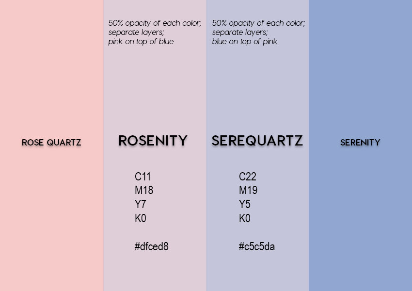
Tip: You’d think (or at least I did) that the resulting blend of the 2 colors would be the same, regardless of the color layer order, but no! This surprised me, honestly. And looking at the blends more closely, the one with pink on top is more pink, and the one with blue on top is more blue. (Guess that could have been predictable?) It pays to experiment!
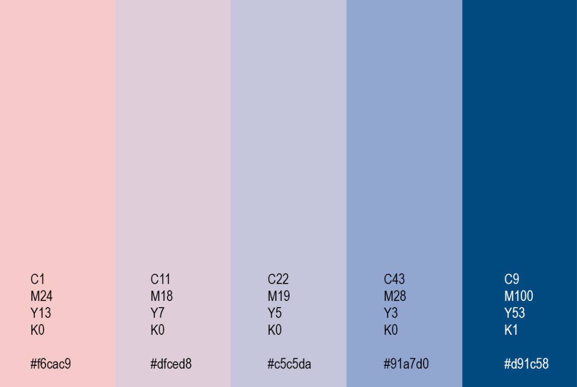
One thing I do like about these 2 COTY is that the pink is on the warmer side, while the blue is cooler. To my mind, this expands the possibilities of combining the colors— if your palette contains a temperature range, if you will, it’s generally going to be more visually interesting, not to mention versatile.
Step 2: Add a “grounding” hue.
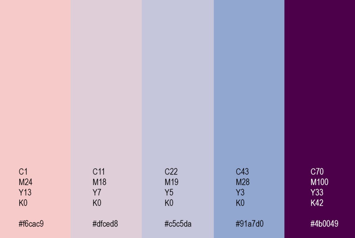
Step 3: Try alternate “grounding” colors.

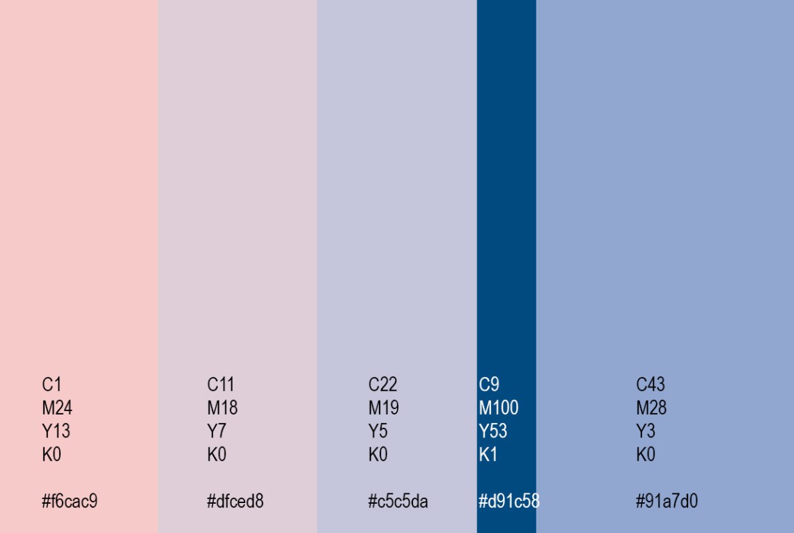
Of course, for most things you’ll use a palette for, you won’t be using the colors in equal quantities— and changing the proportions of the colors can give you dramatically varying results.
Step 4: Change color proportions.
Do try this at home: I deliberately did these palette experiments with the Colors of the Year; because I’m not crazy about them, I thought of this exercise as if I was moving into a new house, and had to make the best of the existing colors!
So do play around with this idea of blending 2 colors in various ways to create an entire palette— I’m betting you’ll be surprised by the results of your own experiments!
Want to see what I’m already doing with these colors (and variations thereof)? Check out this special 2016 COTY collection at Colormusing!

Ahhhhhh enfin quelqu’un qui en parle :))) c’est doux comme couleur comparé au marsala ..
LikeLiked by 1 person
Oui, Je suis bien d’accord! Peut-être si cettes couleurs sont séparées, mais tout ensemble… Non.
LikeLiked by 1 person
C’est ce qu’ils disent eux.. De pantone .. Ils disent que les deux ensemble s’équilibrent pour créer une ambiance zen !
Rires ..
LikeLiked by 1 person