
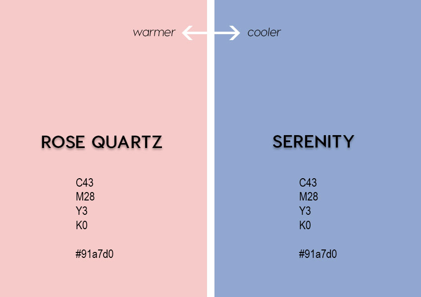
Just in from the color gurus at Pantone: For 2016, there’s not one, but two Colors of the Year! I present to you… Rose Quartz and Serenity!

I’m still trying to decide how I feel about these colors. To be honest, at first glance, I can’t help thinking “baby pink/baby blue”. (I’m guessing that’s not what Pantone was aiming for.) But I’m reserving further judgment, because, for one thing, I believe it’s the 2 colors next to each other that makes me feel the baby vibe.
However, looking at each hue separately, I can start to see some possibilities, which I’ll be exploring in later posts, including ideas for colors that might play nicely with these fraternal twin Colors of the Year.
Aside: When you look at Pantone’s home page, notice how they’ve already incorporated the 2016 COTY into their site’s color palette? This is one of the simplest ways to start using Colormusing’s own palettes in your work, whether it’s your blog, social media profile page, company website— or all of the above! End of aside.
To give you a few ideas for using these colors, I’ve just added a new Collection to the Colormusing shop, showcasing our products that feature various versions of the Colors of the Year!
Warning! Even more blatant promotion ahead! Want to get all Colormusing’s news, color stories, ideas, inspiration, tutorial links, and discount codes all in one convenient little e-mail every month? Click here to sign up for Hue News now!

2 Comments