

Valentines. Hearts, flowers, pink, red, shiny, chocolate-y, sparkly, sweet— today, they’re all around us, in fact, we can’t get away from them. But here’s the thing: I really wanted to show you a quick Valentine-esque project, one that would show you an easy way to apply a color palette to the most basic typographic design— but I didn’t want to throw even more saccharine-sweetness at you. So I designed this graphic, bold thing to be merely the vehicle for adding a bunch of useful skills to your own design toolkit:

Tip: I use Adobe Illustrator CC (Creative Cloud), but the techniques for this project should translate to almost any draw (vector) application.
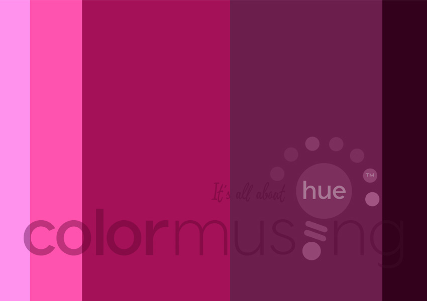
1. Choose your palette. I’m using Colormusing’s Heartbeat color palette. Its non-typical pinks and deep wines should work well. For this type of project, a palette with a distinct light-to-dark color range is ideal.
-

2. Set up your document, then type your letters; use the Text tool, and choose a big, blocky typeface; I used Arial Black for this example. Type each letter separately (not in a continuous line) so you can move them around. Notice the Library of colors at lower left; these are the colors from my palette.
Tip: Colormusing palettes always come with hex numbers, the 6-digit numbers like the one you can see in the Library (above), as well as CMYK values, for every palette hue. Having all this information at your fingertips really makes it easy to apply the palette colors to your projects!

3. Change type to outlines (optional). Select all your letters, go to the Type Menu, then Create Outlines. This turns each letter into a graphic element, rather than editable type, so it’s like working with pictures, rather than a typewriter. Here, you can see the points around each letter, instead of the line at the bottom of each letter that you see when it’s still type.
Tip: If you want to be able to change your typeface later on, skip Step 3!

4. Add colors to your letters. Select a letter, then click on a color from your palette Library (or the Swatch Library). Here, I’ve used the lightest palette hue for the L, but decided afterwards to use this color for the background. 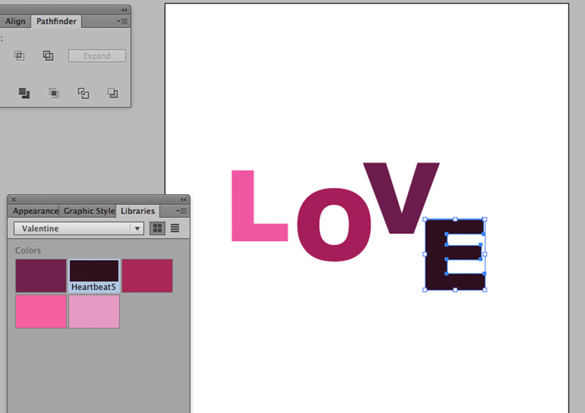
Repeat Step 4 with the remaining letters. Here are my letters with all the colors filled in; notice how using them in this order creates an ombré effect? 
5. Create your background; using the Rectangle too, and using Illustrator’s rulers as a guide, I’ve drawn a 5″ x 7″ rectangle (standard card size), and clicked on the lightest pink in my palette to fill the rectangle. 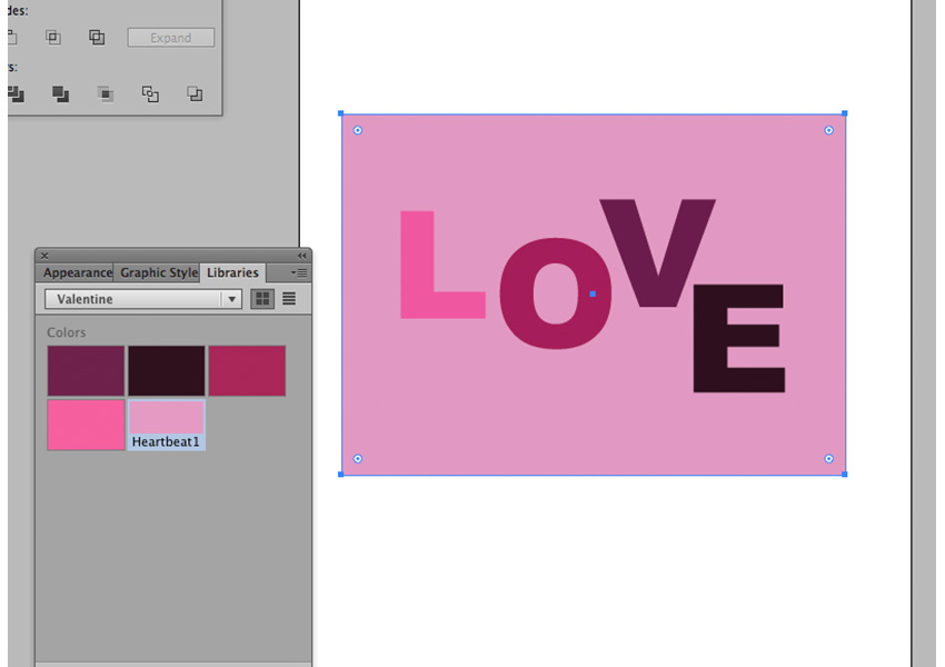
6. Position your background. Go to the Object menu, Arrange, Send to Back; this will make your letters sit on top of the rectangle. Then drag your rectangle until it’s where you want it. 
7. Change background transparency (optional). Select your rectangle, open the Transparency window, and move the Opacity slider. Play around with this; when I changed my background to 50% transparency, the letters seem to pop out a lot more. 
8. Change the background to a gradient (optional). Click on the Gradient tab; click at the far right end of the gradient slider (the horizontal bar), which should add a pointer under the bar. Click on the pointer, then click on your background color in the palette Library. If desired, change the angle of the gradient; here, you can see I’ve changed mine to -90°, which positions the lightest part of the gradient at the top of my rectangle. 
9. Resize your letters. Almost done! Select all your letters (not the background), hold down the Shift key, then drag to make all the letters bigger; you’ll probably want them to be bigger than your background, as shown here.
Tip: Holding down the Shift key constrains the proportions of whatever you’re resizing; if you don’t hold it down, the letters could get tall and skinny, or short and wide. (Hey, maybe you want to do that! That’s okay!)

10. Overlap your letters. Select 1 letter at a time, then drag it around until each letter overlaps the next in some way. You can just call it a day right here, or go on to the next step.
Tip: If you want to make a letter on top of another one when it’s currently under it, select the letter you want to be on top, then go back to the Object menu, Arrange, Bring to Front. This is one of my very favorite tools in Illustrator!
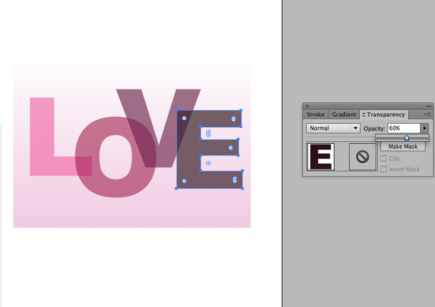
Step 11: Change letter transparency. Select 1 letter at a time, and play around with the Opacity slider again. Here, I’ve made all my letters 60% opacity. See how that changes colors where the letters overlap? 
Step 12: Change the background transparency (optional). After changing my letters to 60% opacity, I thought the whole thing was looking a little washed out, so I decided to try changing the opacity of the background back up to 100%. See the difference from Step 11? I like this a lot better! And that, folks, is how you make Arial beautiful! Now go out there and try some variations on this theme:
- Use a different typeface for each letter;
- Use a combination of upper- and lower-case letters;
- Use the entire color palette (as in the stripes of all colors) as the background, with about 40-50% opacity;
- Combine 2 different palettes, in complementary colors. For example, a palette of shades of blue would work well with a yellow/gold palette; use one for the letters, the other for the background.
And that’s just off the top of my head— I’m sure you’ll think of many more! Which reminds me that I’d love to see what you do with this tutorial! Keep me posted, okay?

Did you know… the color palette featured in this tutorial, Heartbeat, is available as part of a new 4-palette set? This saves you 50% versus purchasing the palettes separately!
See more Colormusing palettes (and lots of things I’m doing with them) at Colormusing.com! And be sure to sign up to receive Colormusing’s free monthly e-mail newsletter, Hue News, while you’re visiting!
