
When I approached the Craft Industry Alliance recently with an article idea about using color effectively in merchandising, they asked if I would instead be willing to write about color forecasting, a subject they said many of their members were asking to have addressed. So for the Alliance’s newly-minted Journal (for members in a wide variety of craft-based businesses), I wrote this article, which was published last week:
Forecast: Color Ahead! Identifying & Creating Color Trends for Craft
Even though the requested 1000 words is less than my typical blog posts, writing on this subject was no small task. I decided to focus on what I believe myself about color forecasting for our individual business futures: We need to trust our instincts.

A brief excerpt:
What are trends? Trends happen in response to many influences, from politics to popular culture. The key word here is response; trends are reflective of what’s already happening, not of what may happen in the future. So if we’re following trends, we are by definition followers. And that’s simply not good for business — especially a creative business.
There’s a big difference between trend-spotting and trend-setting. My feeling is, if you’re spotting a trend, it’s already happening. When I was running my yarn shop, I had to make decisions about my merchandise at least six months ahead of when it would actually be available to my customers. If I’d been following trends, my merchandise would have arrived too late. In the craft world, we need to be setting the trends instead of spotting them.
Ah, but how do we do that?
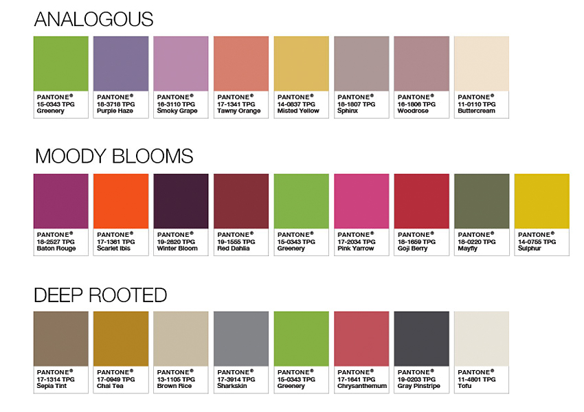
My article also includes a few of my own color forecasts for summer and fall 2016. Can you guess which season this one is for?

BONUS: One thing that didn’t make it into the final article was my sidebar listing some of my own favorite resources, so I’m giving them to you right here!
To give you an idea of the current color trends, here are links to a few of my favorite resources for color trend information.
Pantone: Beyond the Color of the Year, Pantone’s website offers numerous free resources from defining what color is to the psychology of color and much more.
ColourLovers: Colourlovers is an online community of artists, designers, and people who just love color (I mean colour)! In addition to literally millions of color palettes to inspire you, there’s a blog, trend information for various industries, and tools to create your own palettes and more. (To see me/Colormusing on ColourLovers, click here.)
HGTV.com: This is obviously oriented around interior design and decorating, but think about that— if you make quilts, create fine art, knit blankets, sew pillows, paint on glass, (you get the idea), this applies to you!
Pinterest: One of my very favorite places to spend time! Click here to see my Color Inspiration board, and here to visit all my official Colormusing pins.
I’d love to know: How do you forecast colors, or any other changeable factor in your business and/or crafts? Are you inspired by something non-typical? What are your own favorite resources?

Want to see sewing stuff from Colormusing? Check out myBratelier (lingerie sewing, including bras!), and Changing Your Clothes, which covers everything from repairs & alterations to dyeing and remaking thrift-shop finds. And don’t miss all my newest projects, including sew-alongs, at the brand-new SewColormusing blog!
Click on the dots above to visit my mother ship, Colormusing.com.

Congratulations on your article! I would use your color palette of during the fall. I love bright colors all year round, but I use them as an accent during the blah months. 😊
LikeLike