
I was out for a walk the other day, impulsively snapping pictures right, left, and center (and a few overhead) with my iPhone, while admiring the gorgeous autumn leaves. When I got home, I took a look at my photos, and as usual this time of the year, felt like I didn’t come close to capturing all the brilliance of the colors I had seen. Here’s one example:
")
Okay, not a great photo. Nevertheless, I think it could still generate some nice color palettes. Let me just ask you first, though:
What colors do you see?
Did you say red? Yellow? Pink or gold? Me too. Then I loaded the photo into my ColorSchemer Studio software, and this is what it generated automatically:

Tip: I like to use ColorSchemer Studio to initially generate my palettes, then I duplicate them on the ColourLovers site, using the hex-number color identifiers from ColorSchemer Studio. Personally, I find it easier to tweak the colors and experiment with alternative palettes off-line.
However, you can do all this directly on ColourLovers; hover your mouse over the Tools menu near the top of the page, and scroll down to COPASO. From there, you can import a photo. (As far as I know, you do need to set up a free ColourLovers account first.)
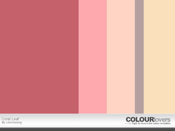
Going back to ColorSchemer Studio, I moved the white color-picker circles around until I got this palette:

And here’s the finished palette in ColourLovers:

I was going to do a third palette, but I think I will do that in my next post; right now, I think it would be a good idea to talk about ways to actually use these palettes.
Let’s start with Barking. Clearly, it’s quite dark, except for the lighter grey and bright pop of peach; where could this be put to use? Funny, the first thing that comes to my mind is a bedroom. I know the modern trend is to have bigger bedrooms, the theory being they can become multi-purpose rooms, but personally, I like a bedroom to be dedicated to sleeping. (Okay, maybe also for coffee and crossword puzzles on a lazy morning.) If you picture a room in which most of Barking’s darkest colors happen in solid wood furniture, it could make sense, especially with sheets and an accent pillow or two in the peach and silver shades. And I could see a Berber-style carpet in one of the lighter grey tones.
Moving on to Coral Leaf, my first inclination is to use it in a wardrobe context. In warm weather, I could see a creamy, pale-gold linen dress, worn with coral, pink, and peach accessories (multiple mixed-texture bangle bracelets in assorted colors, deep coral-red shoes, print scarf), with a taupe clutch to ground all the soft floral tones. (Red lipstick would be a nice finishing touch too.) In cooler times, perhaps taupe wool trousers with a cozy sweater striped in corals and pinks, pale gold leather gloves, and red shoes.
Well! I don’t know about you, but neither of these palettes was what I had in mind when I was thinking about doing a post on autumn-inspired color palettes. This is a good reminder to really look at everything, or rather, to see what we’re looking at— the whole picture, background and all.
Please note: I don’t get anything at all out of telling you about either ColorSchemer Studio or ColourLovers; they’re just (respectively) software and a website that I really like. If that changes, I’ll let you know immediately.

I’m glad you notice the leaves and how beautifully simple and gorgeous they are–especially this time of year. Nature – amazing!
LikeLike