The day before yesterday, Valerie Thibodaux launched her first-ever website: Markham Caerus! Since my professional background includes graphic design (and did I mention that she’s my daughter?), I helped her develop the look and feel for this new site, including typography, layout, photo styles, and (of course) a color palette.
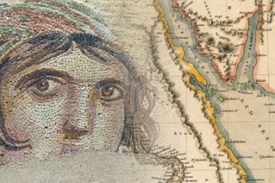
This palette is derived from 2 main sources: a mosaic that’s one of Valerie’s personal favorites, and antique maps. Why? Valerie is an archaeologist, and her project, Markham Caerus, is dedicated to the protection of art and antiquities from theft and looting.


Here’s one page header, an example of how I applied this palette on the Markham Caerus website:

A closely-related Markham Caerus project is A Year in Provenance (right here on WordPress!), Valerie’s new blog that delves into many specific problems, and possible solutions, in the area of art and antiquity trafficking. I must say that I’ve already learned so much in the 2 weeks she’s been working on this blog— it’s really eye-opening. But it also has a positive orientation, since Markham Caerus is all about finding— and creating— solutions. Here’s the header I designed for this blog:

When you look at both the website and the blog (and I hope you will!), you’ll be able to see the relationship of all the images, background colors, layout, and typography to the color palette. All these elements, along with the actual content, contribute to the overall look and feel: ancient atmosphere in a modern context.


1 Comment