
Well, it’s been an interesting couple of days since my last post, in which I compared using palettes for free from ColourLovers to purchasing color palettes from Colormusing (or anyone else, really). For some reason, the CL website has been basically non-functional since yesterday— I keep getting error messages. (I’ve been a member of CL for several years, and have never, ever seen a problem with the site.)

The interesting part is that not having access to CL’s palette-building tools (which are really cool) means that I need to create my palettes from scratch in Photoshop*— not really a huge deal, but I’ve gotten used to doing the initial work on ColourLovers, then importing my palettes into Photoshop (PS) to separate the colors into layers, and the various other things I do to get them ready to bundle and sell. Since my palettes continue to live on ColourLovers, as well as in PS, this is just more efficient for me.
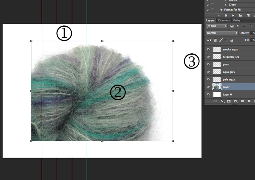
However, being ever the intrepid palette producer, I forged ahead in PS to make my Atoll color palette inspired by the hand-painted yarn shown above.
Aside: Yes, there is a chicken-or-the-egg aspect to my palette creation, i.e. sometimes the things I make, like photo montages or hand-painted yarns, come first (as in this case), and the palettes are derived from those products. But other times, the palette comes first, and then I design things based on those palettes; Knittique’s Scraplet Skeins are a good example. End of aside.
Here’s how I did it.
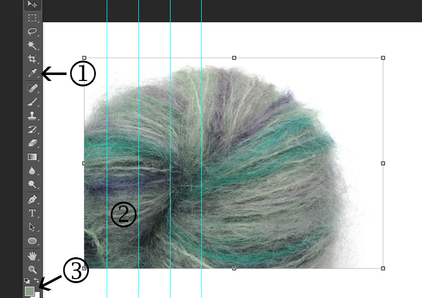

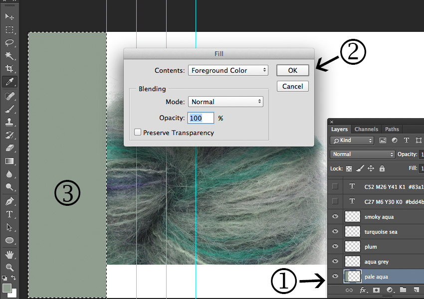
To complete your palette, repeat Steps 2-4 using the Eyedropper tool to choose new colors for each section, the Selection tool to select a different area to fill, and selecting a new color layer for each color.
Here’s my palette after choosing all 5 colors:

Now I’m not so sure about that first color, so I’m going to brighten it up a bit:

And here’s how it looks after brightening that first color:

And there it is— a beautiful new color palette! Now you can play around with the color proportions by selecting a single color layer and resizing the colored section; it’s amazing how the feel of a palette can completely change when you do this. For example, in this palette, imagine how it would look if the largest color section was that deep plum color! I’ll be covering the topic of proportions in an upcoming post. Meanwhile, get out some photos with colors you love, and try this out!
And I know you’re dying to ask— what do you DO with a color palette, anyway?? To answer that adequately would probably take me about 100 posts, but I’ll be getting started on that next. Stay tuned!
*I’m using Adobe Photoshop CC (Creative Cloud), the 2014 version, but this same process can be done with PS Elements as well. And for those of you using other paint programs, I’d love to hear about your palette-making projects!
Update: As of this afternoon, it looks like ColourLovers.com is alive, but there might still be sporadic issues. Progress!
